## Merge datasets together
childcare_counties <- merge(childcare_costs, counties, by = "county_fips_code")

## Creating region variable
childcare_counties <- childcare_counties |>
  mutate(region = case_when(
    state_abbreviation %in% c("CT", "ME", "MA", "NH", "RI", "VT") ~ "New England",
    state_abbreviation %in% c("DE", "MD", "NJ", "NY", "PA") ~ "Middle Atlantic",
    state_abbreviation %in% c("AL", "AR", "FL", "GA", "KY", "LA", "MS", "NC", "SC", "TN", "VA", "WV") ~ "Southeast",
    state_abbreviation %in% c("IL", "IN", "IA", "KS", "MI", "MN", "MO", "NE", "ND", "OH", "SD", "WI") ~ "Midwest",
    state_abbreviation %in% c("AZ", "NM", "OK", "TX") ~ "Southwest",
    state_abbreviation %in% c("AK", "CA", "CO", "HI", "ID", "MT", "NV", "OR", "UT", "WA", "WY") ~ "West"
  )) |>
  na.omit()

## Mutating cost variables to represent annual costs instead of weekly
childcare_counties <- childcare_counties |>
  mutate(mc_year = mc_preschool * 52) |>
mutate(mfcc_year = mfcc_preschool * 52)Exploring Regional Socioeconomic Dynamics: Childcare, Income, Unemployment, and Poverty Insights
STA/ISS 313 - Project 1
Abstract
This project explores socioeconomic dynamics across US regions using data from the National Database of Childcare Prices. The analysis focuses on two key trends: (1) the relationship between median household income and median annual childcare costs for preschool-aged children in 2018, differentiating between family-based and center-based care, and (2) changes in unemployment and poverty rates from 2008 to 2018 across regions. Utilizing a scatter plot with regression lines, the first analysis reveals a positive correlation between median household income and childcare costs, with small differences between family- and center-based care, and a few notable regional variations. In the second analysis, line and ribbon plots respectively depict mean and standard deviation trends for unemployment and poverty rates over time. The plots reveal changes in unemployment rate and poverty rate do not consistently correspond over time, but there is a distinct peak in poverty rates around 2013 across all regions. These findings provide valuable insights into regional economic disparities, shedding light on childcare costs and accessibility and the aftermath of the 2008 recession on unemployment and poverty rates.
Introduction
Our main dataset, childcare_costs.csv, came from the National Database of Childcare Prices. The data ranges from years 2008-2018. The data was created by the ICF and the Women’s Bureau. The data includes information from each year on various socioeconomic characteristics of every US county, including attributes like median cost of childcare, median household income, unemployment rate, and poverty rate. We will additionally use another dataset, counties.csv to identify the locations/states of the counties in the childcare_costs.csv , which only identifies counties by FIPS code.
The project presents a brief exploration of socioeconomic dynamics between regions of the United States, examining how regions differ across two focuses: the relationship between household income and childcare costs, and the variation of unemployment and poverty rates over time. By analyzing these key indicators of overall economic welfare, our project aims to highlight regional differences and areas of improvement.
Question 1: In 2018, how does the relationship between median household income and median annual childcare costs differ across regions of the United States and between Family- vs Center-Based Care?
Introduction
The relationship between median household income and childcare expenses is a pivotal aspect of socioeconomic studies, as it directly influences family budgeting, parental employment decisions, and, more broadly, economic growth. Our research question focuses on examining the relationship between median household income and the median annual childcare costs for preschool-aged children of each US county in 2018. It separates childcare costs into two categories: family childcare versus center-based care. We were interested in the relationship between income and childcare costs because it is essential to understand the financial burdens faced by families, as this information can be used to create more equitable and supportive environments for families with young children. Additionally, since the study that gathered the data separated childcare costs depending on if it was family- or center-based, we thought it would be interesting to see if these different types of childcare costs varied, and in what ways if so.
From childcare_costs.csv, we utilized the variables mc_preschool, mfcc_preschool, study_year, and mhi_2018, which respectively are the median cost for center-based childcare (preschool aged children), the median cost for family-based childcare (preschool aged children), study year, and median household income in 2018 dollars.
We also utilized data wrangling and mutations before plotting. To start, we merged the counties.csv and childcare_costs.csv into a new dataset, childcare_counties.csv. We merged the two using the county_fips_code variable, which both datasets contained. For mutations, we first created a new variable region, by sorting the counties based on their states into 6 US regions: New England, Middle-Atlantic, Southeast, Southwest, Midwest, and West. Additionally, we mutated mc_preschool, and mfcc_preschool into mc_year and mfcc_year by multiplying each by 52 to represent the annual median cost, as the variables in the original dataset were weekly costs. This made more sense for our plots, as median household income is also an annual value.
Approach
We used a scatter plot with median household income on the x-axis and median annual cost for child care on the y-axis. The median cost is grouped into center-based and family-based childcare, and this is represented with two different colors of points. Our plot is also faceted by the 6 different regions in the US.
For this plot, we also filtered our data for values from 2018 only. We did this because we wanted to only look at the most recent year from the dataset to minimize external factors or events that could introduce bias or confounding factors into our analysis. We chose a scatter plot because it allows us to see the relationship between median household income and median annual childcare costs, and the variation and strength of this relationship.
Furthermore, by using different colors, we can compare the two types of childcare expenses within each region. This visual differentiation will help us understand any disparities or similarities between the two types. Faceting by regions allows us to see how the relationship between median household income and median annual childcare costs varies across different geographic areas, if at all. Also, this will be useful to help identify any patterns or trends that may exist, both within regions and across regions.
Analysis
childcare_counties |>
  filter(study_year == "2018") |>
  ggplot(aes(x = mhi_2018)) +
  geom_point(aes(y = mc_year, color = "Center-Based"), size = .5, alpha = 0.6) +
  geom_point(aes(y = mfcc_year, color = "Family-Based"), size = .5, alpha = 0.6) +
  geom_smooth(aes (y = mc_year),
              method = "lm",
              se = FALSE,
              color = "black",
              linewidth = 0.75,
              )+
  geom_smooth(aes (y = mfcc_year),
              method = "lm",
              se = FALSE,
              color = "black",
              linewidth = 0.75,
              )+
  geom_smooth(aes (y = mc_year),
               method = "lm",
               se = FALSE,
               color = "#3886EA",
               linewidth = 0.5) +
  geom_smooth(aes (y = mfcc_year),
               method = "lm",
               se = FALSE,
               color = "darksalmon",
               linewidth = 0.5) +
  facet_wrap(~ region) +
  scale_y_continuous(labels = function(y) paste0("$", y)) +
  scale_x_continuous(labels = function(x) paste0("$", x/1000, "k")) +
  scale_color_manual(
    name = "Type of Childcare",
    values = c("Center-Based" = "#3886EA", "Family-Based" = "darksalmon")
    ) +
  labs (
    x = "Median Household Income",
    y = "Median Annual Cost of Childcare",
    title = "Median Household Income vs \nMedian Childcare Cost (Preschool-Aged) in 2018",
    subtitle = "Represented Across US Counties"
    ) +
  theme_minimal() +
  theme(panel.grid.minor.y = element_blank())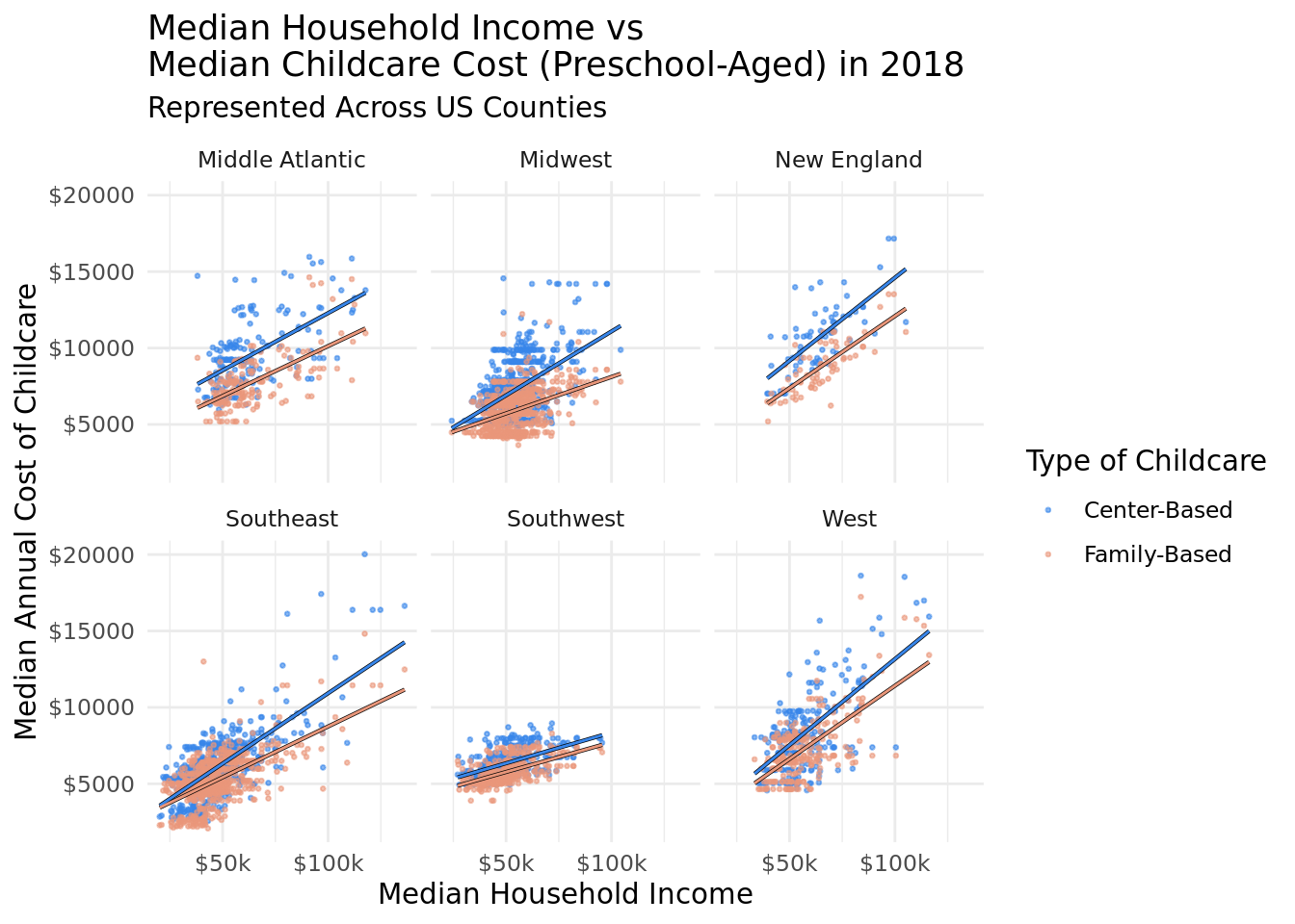
Discussion
Our plot shows that there is a positive relationship between median household income and the median annual cost of childcare, for both family-based and center-based. As median household income increases then so does the median cost of childcare. This general positive trend is consistent across the 6 different regions of the US. There is one most notable difference between regions, which is that the Southwest region has much flatter slopes than all other regions. This means that for each dollar increase of the median household income in a county in the Southwest, the median cost of childcare is not expected to increase as much as all other regions. This could be in part attributed to the fact that the Southwest has a much smaller range of median household incomes, and across all counties in the Southwest in 2018, the median household income did not exceed $100k.
The regression lines we added showing the relationship between median family-based childcare ~ median household income, and median center-based childcare ~ median household income, show that family-based care is generally a little cheaper. The slope of the center-based regression line and family-based regression line appear parallel in the Middle Atlantic, New England, and Southwest, indicating that for each dollar increase in median household income, the increase in median center-based and family-based childcare costs will be similar. In the Midwest, Southeast, and West, the slope for family-based care is less steep than center-based, meaning that as median household income increases, the predicted increase in cost of family-based care will be less than the increase in cost for center-based care.
Some of the high steepness in slopes, such as for the West region, could be reflective of the higher cost of living in these regions, and possibly a greater availability of higher-priced childcare options that align with higher incomes. On the flip side, the flatter slopes in the Southeast could reflect the lower cost of living in this region, and less economic diversity. This variability might be influenced by differences in state policies, urban vs rural distribution, or economic diversity within these regions.
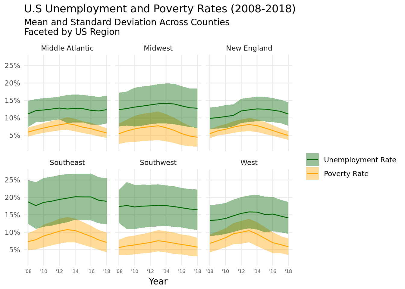
Question 2: From 2008 to 2018, how does the poverty rate and the unemployment rate change across regions of the United States?
Introduction
For the second question, we looked at how the poverty rate and the unemployment rate in the United States has changed between 2008 and 2018, and if there is a pattern between those rates. From the original childcare_costs.csv, we looked at the variables pr_p, and unr_16, which respectively are the poverty rates for individuals, and the unemployment rate for people above the age of sixteen. By looking at how these rates change over time, we can (a) look at how the fallout from the 2008 recession over ten years affected basic economic indicators such as unemployment and poverty, and (b) see how the unemployment rate over time may be correlated with the poverty rate.
Additionally, we did perform some data wrangling prior to plotting. Because we wanted to look at the mean and standard deviation of the unemployment rate and poverty rate from each year for all 6 regions, we created a new data frame called us_stats that grouped by region and study year to calculate the summary statistics for each year for each region.
Approach
We combined line plots and ribbon plots to illustrate the mean and standard deviation of every US county’s unemployment rate and poverty rate over time. We set the x-axis as years, from 2008-2018, and we stacked the plots to have two y-variables, the unemployment rate and poverty rate, which follow the same scale as a percent of the total county population. These two rates are also represented with different colors, so as to easily visualize which is which. We also faceted by US region again.
We chose to do a ribbon + line plot combination because it clearly shows the distribution of the rates over time. Because we are trying to summarize trends across all US counties, there is inevitably going to be a lot of variation, so it was important for us to document the standard deviation as well as the mean, in order to get the clearest picture on the data. Additionally, since the overall goal of our project was to examine socioeconomic variation across regions, we chose to facet by regions again for consistency with our first plot and for easy visual comparison between regions.
Analysis
## Creating new dataframe to contain means and SDs for each year for each region
us_stats <- childcare_counties |>
  group_by(study_year, region) |>
  reframe(
    mean_unemployment_rate = mean(unr_16),
    sd_unemployment_rate = sd(unr_16),
    mean_poverty_rate = mean(pr_p),
    sd_poverty_rate = sd(pr_p),
    study_year = as.numeric(study_year)
)ggplot(us_stats, aes(x = study_year)) +
facet_wrap(~ region) +
geom_ribbon(
aes(
ymin = mean_unemployment_rate - sd_unemployment_rate,
ymax = mean_unemployment_rate + sd_unemployment_rate,
fill = "Unemployment Rate"
),
alpha = 0.4
) +
geom_ribbon(
aes(
ymin = mean_poverty_rate - sd_poverty_rate,
ymax = mean_poverty_rate + sd_poverty_rate,
fill = "Poverty Rate"),
alpha = 0.4) +
geom_line(
aes(y = mean_unemployment_rate, color = "Unemployment Rate")
) +
geom_line(
aes(y = mean_poverty_rate, color = "Poverty Rate")
) +
scale_x_continuous(
limits = c(2008, 2018),
breaks = seq(2008, 2018, 2),
labels = function(x) paste0("'", substr(as.character(x), 3, 4))
) +
scale_y_continuous(
breaks = seq(5,25,5),
labels = function(x) label_percent()(x / 100)
) +
scale_color_manual(
name = "Rate Type",
values = c("Unemployment Rate" = "orange", "Poverty Rate" = "darkgreen"),
labels = c("Unemployment Rate", "Poverty Rate")
) +
scale_fill_manual(
name = "Rate Type",
values = c("Unemployment Rate" = "orange", "Poverty Rate" = "darkgreen"),
labels = c("Unemployment Rate", "Poverty Rate")
) +
labs(
title = "U.S Unemployment and Poverty Rates (2008-2018)",
subtitle = "Mean and Standard Deviation Across Counties \nFaceted by US Region",
x = "Year",
y = NULL
) +
guides(fill = guide_legend(title = ""), color = guide_legend(title = "")) +
theme_minimal() +
theme(
axis.text.x = element_text(size = 6),
axis.title.x = element_text(vjust = 0),
panel.grid.minor.x = element_blank(),
panel.grid.minor.y = element_blank()
)
Discussion
Our visualization illustrates that there are differences between the poverty rate and unemployment rate in different regions across the US. Notably, the Southeast has a much larger standard deviation for unemployment rate, indicating that county unemployment rate varies a lot more across counties in the Southeast than in other regions. On the other hand, the Middle Atlantic and New England regions have the overall lowest unemployment rates from 2008-2018, as well as the smallest standard deviations.
While there are some slight shifts in the unemployment rate over time, none of the changes are too prominent, nor apply to every region. On the other hand, the mean poverty rate for all 6 regions notably increases from 2008 - 2013, and then decreases from 2013-2018, with a clear peak at 2013. Though the difference in minimum poverty rate to peak poverty rate is different across the regions, they do all follow this pattern. Interestingly, there is not a clear or consistent correlation between the changes in mean unemployment rate and the changes in mean poverty rate over time; in some cases when the poverty rate is increasing, the unemployment rate decreases, but sometimes they increase together, etc. However, across regions, we can see that for Middle Atlantic counties and New England counties, they have both a distinctly lower standard deviation for both the unemployment rate and poverty rate.
The 2008 recession is a likely reason explaining the increase in poverty rate from 2008-2013. 5 years is a reasonable amount of time for the US economy to address the crisis and recover, which could explain why the poverty rate begins steadily decreasing from 2013 onwards. In terms of the differences in unemployment and poverty across regions, rural vs. urban communities, economic opportunities and the state of the local economy, and state welfare policies could all be reasons for these discrepancies. For example, the Southeast has a lot more rural communities than New England, which is more urban, and this could correspond to job opportunities; there may be fewer job opportunities in the Southeast, and therefore the unemployment rate is higher.