Taylor Swift (Soon-to-be Kelce)
STA/ISS 313 - Project 1
Abstract
Taylor Swift is an icon: Times’ 2023 person of the year, one of the highest streaming artists in the world, and Travis Kelce’s girlfriend. In this project, we set out to gain a deeper understanding of Taylor Swift’s discography, specifically how her singles differ from album only songs and how her music has changed overtime. To do so, we created four data visualizations from the Taylor R package from Tidy Tuesday Data. We found that on average her singles had higher energy but lower tempo than album release tracks. Further, we found the energy and valence of her music hasn’t changed much overtime. Lastly, we looked into how her re-recordings scored relative to her initial releases. By doing this, we were able to see that her metacritic and user scores have increased from the original release to Taylor’s version.
Introduction
This project analyzes the Taylor Swift R package, which was created by W. Jake Thompson. The data comes from Genius and the Spotify API. The data set includes three .csv files: taylor_album_songs, taylor_all_songs, and taylor_albums. In our project, we only are only using the taylor_all_songs and taylor_albums data frames. This is because taylor_album_songs excludes singles releases and excludes the original releases of albums that now have a Taylor-owned alternative; in our project, we wanted to include the original releases, so we could compare them to the re-releases, and overall, provide a holistic analysis of Taylor Swift overtime. Additionally, this project uses the taylor_albums dataset - in order to have data about each albums as a whole.
This project seeks to investigate two questions: The first being: How do Taylor Swift’s single releases differ from the songs on the full albums? Second, we explore: How have Taylor Swift’s songs changed over time? The variables used to answer these questions are from the two .csv files mentioned above. From taylor_albums, we used : album_name (Album name), album_release (Album release date), metacritic_score (Metacritic score), and user_score (User score). From taylor_all_songs, we used : album_name (Album name), album_release (Album release date), single_release (Single release date), energy (Spotify energy score - a measure from 0.0 to 1.0 that represents a perceptual measure of intensity and activity), valence (Spotify valence score from 0.0 to 1.0 - high valence sounds more positive, while low valence sounds more negative), and tempo (The overall estimated tempo of a track in beats per minute). More information about the data sets can be found in the README file.
Question 1: How do Taylor Swift’s single releases differ from the songs on the full albums?
Introduction
Choosing what songs to release as the singles before an album comes out is a key piece of strategy for any artist. The single should be a good representative of the album as a whole, should be very popular, and should leave the listener eager to hear the entire album. Many of Taylor Swift’s most well known songs are her single releases, so we decided to see how the energy and tempo of her singles compare to the rest of her songs. From this, we hope to identify an aspect of her songs that make the songs better candidates to be single releases, and in this way, we can understand Taylor Swift and her team’s decision making process in a new way. To answer this question, we will use only the taylor_all_songs .csv file. Specifically, we will use the energy and tempo variables to compare single releases to album releases
Approach
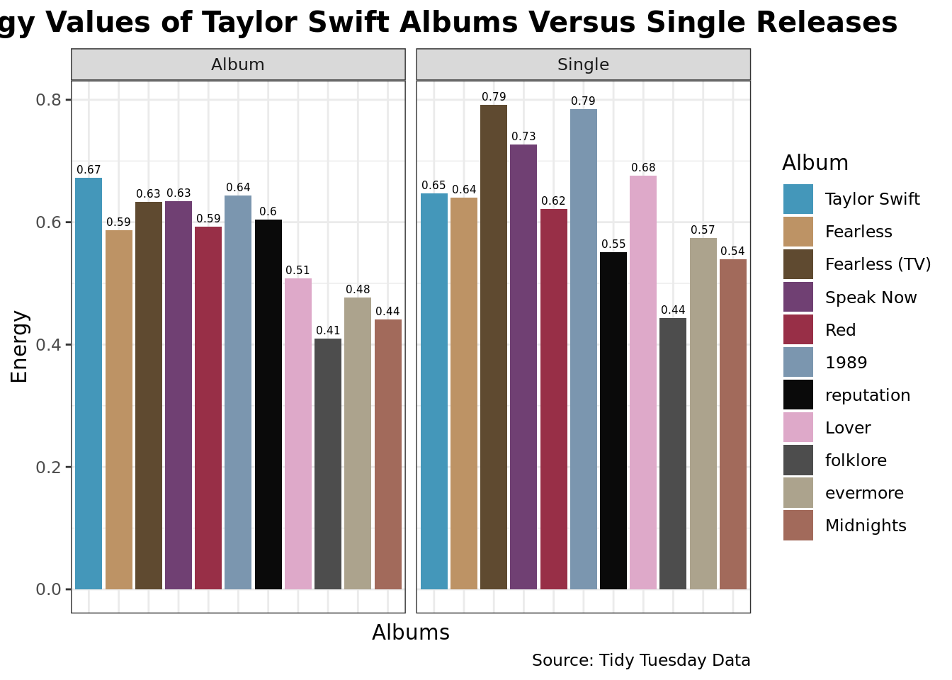
For the first plot, we use a barplot (geom_col) to compare the energy levels of songs, and we faceted based on whether the songs came out on a single release or on the regular album release. We chose this plot because it is makes it easy to compare the single energy values to the regular album energy values. Additionally, it enables the reader to compare the energy values of singles or from albums across all of Taylor Swift’s releases. We thought this would be a great visualization strategy because of this ease.
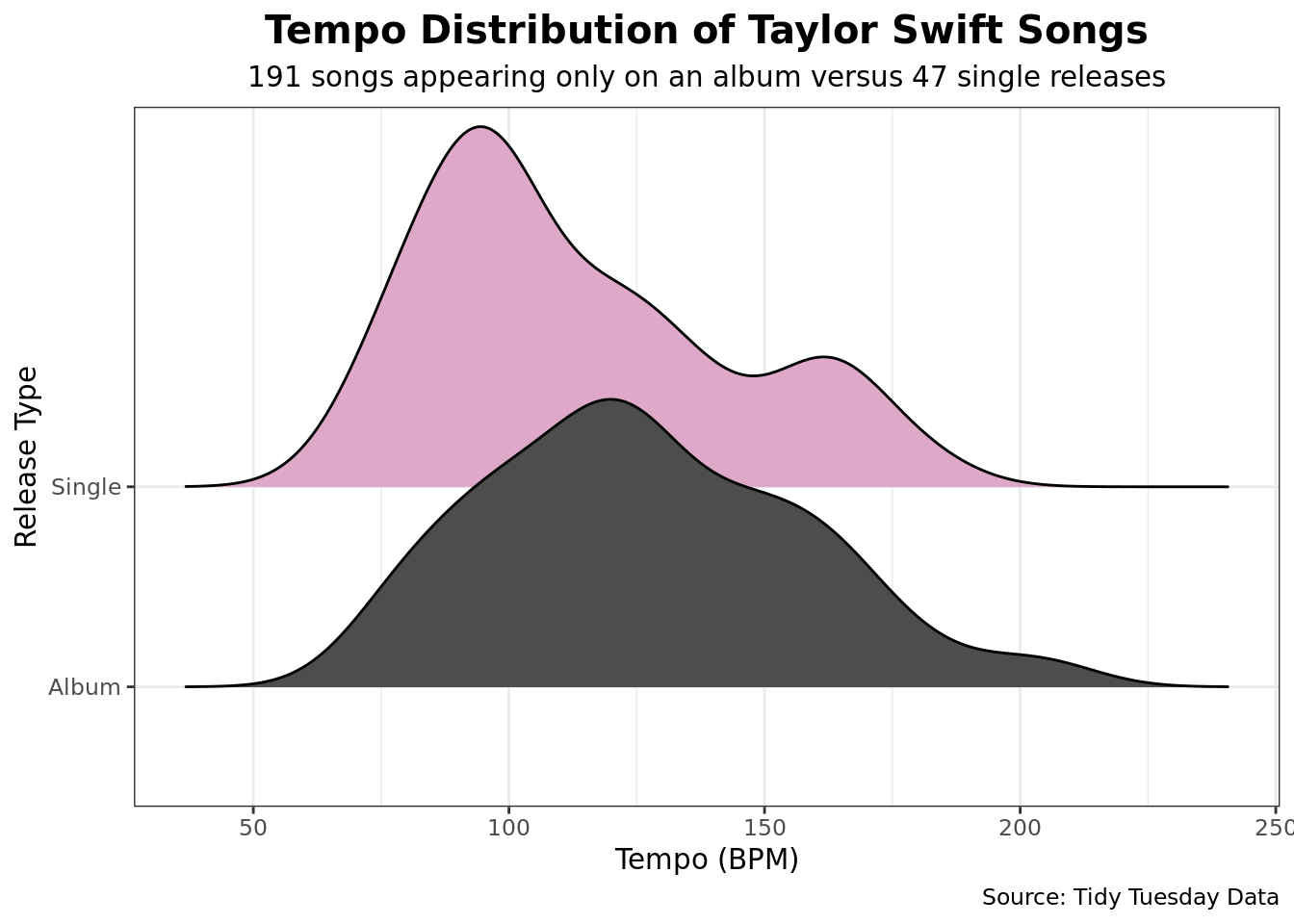
For the second plot, we use a Ridgeline plot (geom_density_ridges) to compare the tempo of songs released on an album versus as a single release. For this visualization, we chose a ridgeline plot because of the way it conveys the distribution of songs over the tempo range. With the two curves on the same plot, it makes it easy to see where they trend similarly and where they are different. This choice of ridgeline is great because it enables the reader to visualize how Taylor Swift’s songs range in tempo based on their method of release.
Analysis
Discussion
The faceted bar chart illustrates that average energy scores of Taylor Swift’s singles on her albums are generally higher than the average energy scores of album-only songs. In fact, out of the 11 albums analyzed, only 2 albums have a lower average singles energy than average album-only-songs energy. Those albums are Taylor Swift and reputation. In fact, the difference between the average energy of singles and album-only songs was 0.07, meaning that the average energy of singles was 12.76 percent higher than the average energy of album-only songs. We speculate that the singles have higher energy since they are intended to grab the attention of the listeners, and typically are projected to be the songs most frequently played on the radio.
The density ridgeline plot illustrates that the tempo of Taylor Swift’s singles seem to be lower than the tempos of her album-only songs. This can be inferred from the fact that the plot for singles sits further to the left than the plot for the album-only songs. The plot for the singles is right-skewed, while the plot for the album-only songs is roughly symmetric. These observations made from looking at the plots are backed up by the data as well, as the average tempo for singles is 113.37 and the average tempo for album-only songs is 126.67. We speculate that this is partially due to the fact that there are so many more songs in the album released category rather than the single released.
Question 2: How have Taylor Swift’s songs changed over time?
Introduction
One of the most incredible things about Taylor Swift is the longevity of her career and the evolution of her artist identity. She has created country music, pop music, folk music, etc. Additionally, she started her career at an notably young age. Her first album, Taylor Swift, came out in 2006 when the artist was merely 16 years old. Today, she is still making music. This sparked our interest in how her songs have changed overtime. Moreover, with Taylor’s recent re-recordings, we wanted to look at how those re-recordings performed relative to the original recordings. We look at this question through two separate lenses: how has Taylor’s literal music changed over time through attributes, such as energy and valence; and how Taylor’s re-recordings of her albums vary in scores from critics and meta-scoring.
To do this, we used the taylor_all_songs and the taylor_albums .csv files. Specifically, we use the energy and valence variables from the taylor_all_songs data frame, and the user_score and metacritic_score from the taylor_albums data frame.
Approach
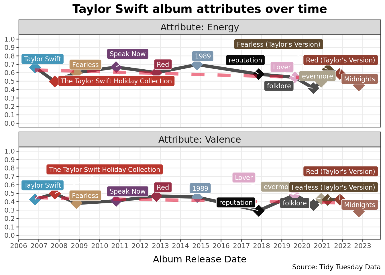
For plot 1, we overlaid a line graph (geom_line), a scatter plot (geom_point), and added a trend line (geom_smooth) to portray how the valence and energy have changed in Taylor Swift’s music over time. We chose to do so with a line graph, with each point emphasized and a trend line - indicating the trajectory of her music overtime. This plot is particularly great for observing this trend because each point is clear, which album it is, and you can see clearly how each album compares to the others.
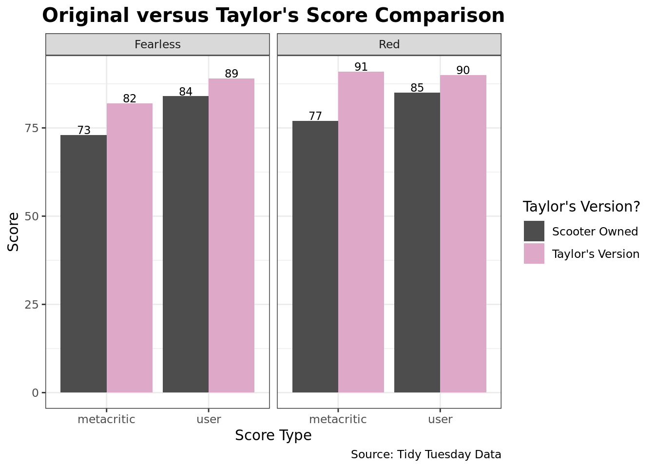
For plot 2, we used a bar graph (geom_col). In this plot, we wanted to address the differences in how Taylor Swift’s re-releases scored relative to their original releases. We chose to do this with a faceted bar graph, because it makes very easy to compare the metacritic versus user scores. This is a very good plot to vizualize this data because the trends between Taylor’s Version and the original Version are very accessible to the reader.
Analysis
Discussion
The scatter plot indicates that the energy and valence scores of Taylor Swift’s albums have not changed over time, despite the fact that she has been making music for over 16 years. While there are some differences between energy and valence scores for different albums, the general trend, as indicated by the line of best fit, has been no change.
The bar chart showing metacritic and user scores for albums that have both a Scooter version and Taylor version also allows us to make key insights about how Taylor Swift’s songs have changed over time. Both the metacritic and user scores of the Taylor’s version songs are higher than the those of the Scooter version songs. The average difference between metacritic scores is 11.5. The average difference between user scores is 5.
The non-existent change over time in terms of energy and valence suggests that Taylor Swift has found a formula for her music that works and appeals to her audience. Given her immense success over time, it does not make sense for her to switch up her style of music. As they say, “if it ain’t broke, don’t fix it.” Furthermore, the differences between metacritic and user scores for Taylor’s version versus Scooter owned albums can be explained by a few possible explanations. The first is that it’s possible that Taylor Swift’s singing and music-making skills have improved over time. Since the Taylor’s Version albums came out later than the Scooter owned albums, this explanation could explain why the scores of the Taylor’s version albums are better. Furthermore, another possible explanation is that Taylor Swift’s popularity has increased over time. This increase in popularity could lead to critics and users giving a better rating now than they would have 10 years ago.