Tackling Tornado Trends
STA/ISS 313 - Project 1
Sources for data cleaning:
https://www.faa.gov/air_traffic/publications/atpubs/cnt_html/appendix_a.html
https://education.nationalgeographic.org/resource/united-states-regions/
Abstract
For this project, our aim is to explore the characteristics of tornadoes within the US and how the nature of tornadoes change based on their environmental conditions, as well as how that negatively impacts the populations in different areas across the country. Our data suggests that there is a relationship between the magnitude and frequency of tornadoes for states across longitudinal lines within the US and that states in longitudinal partitions central to the the southwest and southeast tend to have both higher average tornado magnitudes and higher tornado frequencies. Our data also shows that there’s a seasonal trend of tornado frequency and magnitude. Specifically, there’s an increasing proportion of tornadoes happening in the Spring with the most fatalities due to tornadoes consistently in the Spring as well. We also found that the fatalities of tornado-caused damage is consistent with the change in the average magnitude of tornadoes happening at a given time period, and therefore we are hoping this finding can inform policymakers and population’s awareness of damage prevention and damage control.
Introduction
The dataset we have chosen to explore is from TidyTuesday and was sourced from the NOAA’s National Weather Service Storm Prediction Center Severe Weather Maps, Graphics, and Data Page, which contains data related to tornadoes, hail, and damaging wind dating from 1950 to 2022. This tornadoes dataset contains information regarding the characteristics of tornadoes that have occurred in the United States and U.S. territories, such as their date and time of occurrence, their magnitude, the number of injuries and fatalities caused, their estimated property loss, their path length, their width, and so on. Specifically, there are 32 different variables and 67870 observations with each observation representing one tornado. The variables are a mix of numerical and categorical variables and a range of class types, including characters, doubles, date, and time, and more information regarding the contents of our dataset can be found in our data dictionary located in data/README.md in this repository. For the purposes of our project, we are only analyzing tornadoes in the contiguous U.S., which includes 48 states (excluding Alaska and Hawaii) and the District of Columbia.
Additionally, in order to create a map as a part of our visualization to answer question 1, we also plan to use the us dataset from the maps package, which essentially contains the geom of each state and therefore allows us to create a map of the United States.
Question 1: How may the nature of tornadoes vary by the location they occur in?
Introduction
We are first going to investigate how the characteristics of tornadoes may be influenced by where they occur in the contiguous U.S. and if there are any related trends. In this way, we hope to gain an understanding of any geographical trends that underly tornado characteristics, such as their magnitude and distance travelled. Having such an understanding is helpful to policymakers as well as local and national entities, ranging from healthcare systems to NGOs, in identifying which states and areas in the U.S. are the most vulnerable to the impact of tornadoes and where infrastructure and initiatives to protect populations against tornadoes should be implemented.
In order to investigate this question, we will use information from the dataset regarding the states in which tornadoes occur, their magnitude (measured on the Enhanced Fujita scale that ranged from discrete ratings of 0 to 5), and their path length (indicator of distance travelled by tornadoes and their severity). So, we will use the st, mag, and len variables from the original dataset. From this, we can also obtain variables to count the number of tornadoes that have occurred in each state form 1950 to 2022, average the magnitudes of tornadoes by the state they originated in, and classify the states into regions in which tornadoes have occurred. This will allow us to explore various aspects of geographical trends in tornado frequency and severity.
Approach
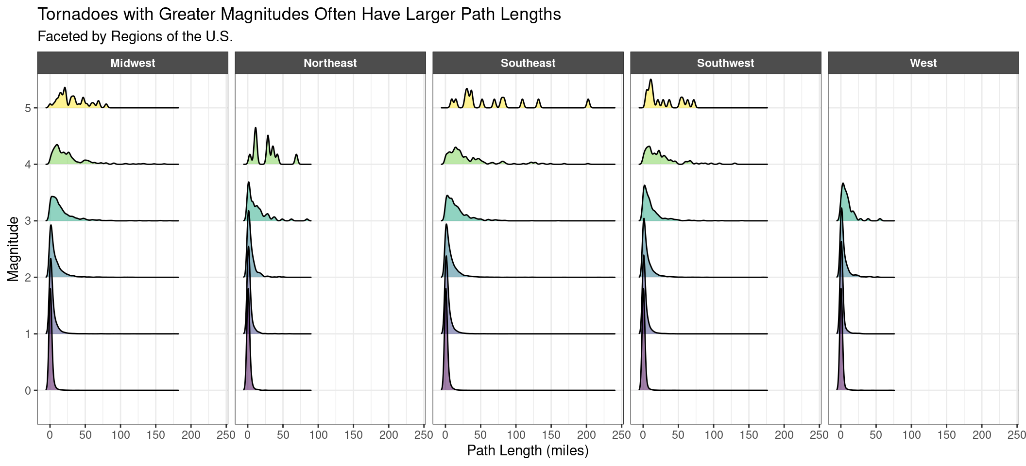
Figure 1
For our first plot, Figure 1, we wanted to visualize how the path length of tornadoes may relate to the magnitude of tornadoes in each of the 5 regions of the U.S. (Midwest, Northeast, Southeast, Southwest, West) to get a higher level understanding of potential geographical patterns in tornado characteristics. We decided to use a ridgeline plot since it is designed to visualize the distribution of continuous numeric variables across different categories, which in our case was the distribution of the path length of tornadoes (len) across the 6 categories on magnitude (mag). We were initially planning on overlaying density curves representing the distribution of the path lengths of tornadoes in each region for each magnitude category, but the overlapping density curves were overlapping too much to the point that it was challenging to differentiate them and identify any regional trends. Therefore, we decided to facet the ridgeline plot by region (region) instead so that we could see how the magnitudes and path lengths and tornadoes may vary by the region of the U.S. they occurred in. We also filled in the area under the density curves using color blind friendly colors by their magnitude to better differentiate the curves across regions by their magnitude category.
Figure 2
For our second plot, Figure 2, we wanted to zone in on individual states in each region to see if regions are actually representative of trends in tornado severity and frequency or if there are categories that better connect states based on the nature of the tornadoes that occur in them. We thereby used geom_sf() to visualize spatial data in the form of a map since we thought using such a plot would allow viewers to quickly and efficiently grasp how characteristics of tornadoes compare across all 48 states of the contiguous U.S. and the District of Columbia.
In order to make the us dataset work well with our existing data frame tornadoes, we created a converter to convert state names to their abbreviation, which is how they are recorded in the tornado dataset. After that, we joined the us dataset with our state-level summary statistics of average magnitude from the state dataset we created based on the tornadoes dataset, and used the resulting dataset to plot the average magnitude of tornadoes that occurred in each states on the map. We used plotly to combine the two plots and add hover labels onto the states on the map to quickly access the state name, region, and average tornado magnitude for the map on the left as well as tornado frequency for the map on the right.
Analysis
Figure 1
Figure 2
Sources:
https://www.datanovia.com/en/blog/how-to-create-a-map-using-ggplot2/
https://bookdown.org/nicohahn/making_maps_with_r5/docs/ggplot2.html - reference for map
Hover label:
https://plotly.com/ggplot2/hover-text-and-formatting/ https://blog.cpsievert.me/2018/01/30/learning-improving-ggplotly-geom-sf/
https://stackoverflow.com/questions/42974231/ggplot-geom-point-ignoring-unknown-aesthetics-text-issue - warning is a bug and not an actual issue
ChatGPT OpenAI for debugging and feature help
Discussion
Based on Figure 1, the faceting by region allows us to see a pattern with the location and magnitude of the tornado. There is an interesting correlation between the strength of tornadoes and the region that it is in. We can tell that the Northeast and West regions don’t have any tornadoes with a magnitude of 5 and the West region also has no tornadoes with a magnitude of 4 or 5. We can infer that differences in general weather aspects change how intense tornadoes are in a region. Additionally, the path length indicates the distance traveled by the tornado excluding sections without surface damage/disturbance, unless other evidence of the touchdown. From the path length variable, we can see that in general across the regions, there is a positive correlation between path length and magnitude. For tornadoes with magnitudes between 0-2 across all regions, its distance traveled generally stays below 50 miles. As the magnitude of the tornadoes increase, the distance traveled grows into the 100-250 mile range. We can conclude that there is a relationship between the distance traveled by the tornado and its strength, which makes sense intuitively since a tornado with higher wind speed (which gives the tornado a higher magnitude rating) would probably travel a longer distance. The last trend we noticed is that the path length for the Northeast and West regions are generally smaller than the other 3 regions, which makes sense for the correlation between path length and magnitude as well. The range for the magnitude of tornadoes in the Northeast and West regions are between 0-100 for both regions even at the highest magnitudes, which is far smaller than the range of tornadoes in the other regions.
From this plot, we are interested in looking more into the patterns between these variables and dependent on region. Thus, we decided to look more at these patterns on a US map to look at the variables and their relationships across all of the states.
From Figure 2, we can tell that our analysis on the regions within the US were oversimplifying our trends. The patterns with the average magnitude and frequency based on the location of the tornado are not based on region, but rather vary individually by state. We can tell that tornado trends align more based on longitude than general region within the US, since if you look at the states based on longitudinal lines, you can tell that they are very similar in color and more so than states in the same region. States in the center and more to the right on the map, like Kansas, Oklahoma, Texas, and even along the line of Iowa and Missouri have a high frequency and average magnitude of tornadoes. This is interesting because they span across the Midwest and Southwest regions. We can conclude in general that the regional grouping is misleading but that there is definitely a relationship between the nature of a tornado and the location they occur in. Although the magnitude and frequency aren’t necessarily correlated, the frequency of tornadoes as well as their magnitude and distance traveled all have a relationship with the state that the tornado traveled across within the US.
Source:
- https://www.govtech.com/em/emergency-blogs/disaster-zone/determining-a-tornado_s-path-width-etc-060513.html - additional path length information
Question 2: How may the nature of tornadoes vary by the season they occur in and over time?
Introduction
For this question, we are interested in exploring the seasonality of tornadoes and how it changes over time. We are inspired because of our only personal experience encountering a tornado in Spring but never in other seasons. Specifically, we want to first explore whether there’s a seasonal difference in terms of how many tornadoes occur, how strong they are, and how much damage they cause. In this way, we hope to gain more understanding of how the season affects the frequency and strength of and damage caused by tornadoes, which can be helpful for the government and people in preventing and controlling damages that might be caused by tornadoes. For example, if we identify there are more tornadoes or tornadoes-caused damage in a certain season, then maybe we can advise the local government to put more resources into damage prevention and control for that specific time.
To explore this question, we will use information from the dataset regarding the time (month and year), their magnitude (measured on the Enhanced Fujita scale that ranged from discrete ratings of 0 to 5), and the damage the tornado causes. Specifically for damage, we decided to use fatalities (measured by the number of fatalities) as a proxy of damage since ultimately human life should always prioritized in terms of damage prevention and control in the face of natural disasters like tornadoes. Therefore, we will use the yr (the year when the tornado occurred), mo (the month when the tornado occurred), mag (magnitude of the tornado), and fat (fatalities caused by the tornado). Additionally, we create two new variables decade and season by categorizing the tornadoes into different decades by the year and by the season in which they occurred.
Approach
Figure 3
For our third plot Figure 3, we wanted to visualize how tornado magnitude and frequency vary by season over time, and therefore we decided to use a stacked bar chart to visualize the proportion of tornadoes at each magnitude (mag) over different decades (decade). Specifically, we colored the bar chart by season (season). We believe this is the best plot we should use to answer this question because it allows us to easily compare the proportion of tornadoes that occurred in different seasons at any given magnitude across different decades, as well as to compare the proportion of tornadoes that occurred in the same decade but across different magnitudes. In this way, we can easily check if there’s any seasonal trend of the frequency and strength of tornadoes at any given decade, as well as how that trend (if any) changes over time across the decades. Therefore, it can be helpful for us to answer the question about seasonality of tornadoes over time.
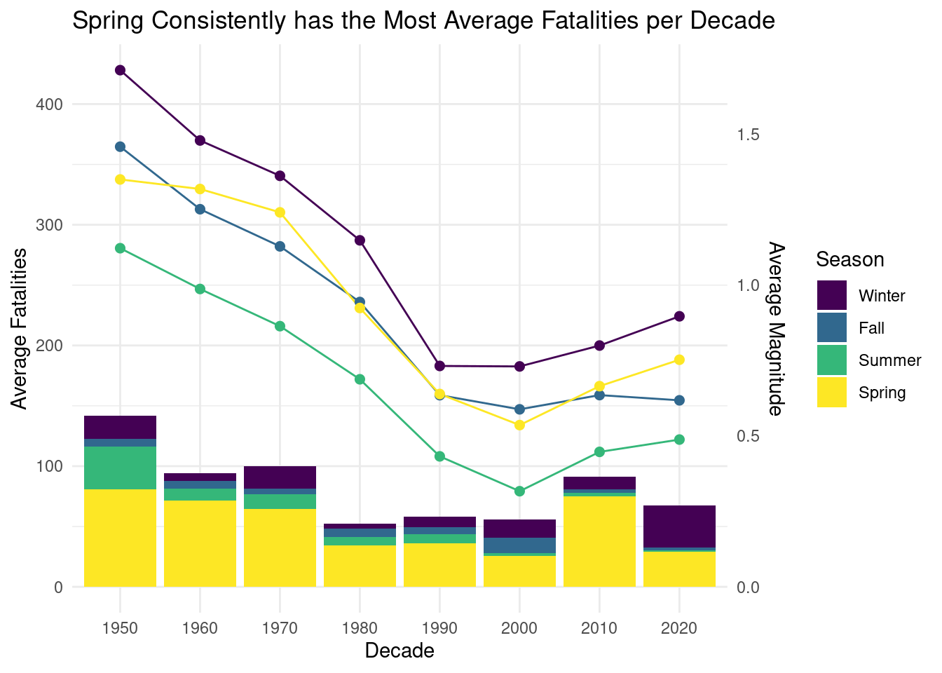
Figure 4
For our fourth and final plot Figure 4, we wanted to visualize the damage caused by tornadoes in different seasons over time, as well as how that damage is affected by the strength/magnitude of the tornado. Therefore, we decided to combine a line plot with a stacked column chart through the addition of a secondary vertical axis. Specifically, we first calculate the total fatalities (fat) of all tornadoes in a given decade, and then divide it by the number of years in that decade (to account for the fact that there are only 3 years of data in 2020 decade, since otherwise it wouldn’t be truly comparable with 10 years of data in other decade but only 3 in 2020 decade), in this way, we get the average yearly fatalities of each decade. Then, we create a stacked column chart of these average yearly fatalities (avg_fat) colored by season (season) across decades (decade) and add a secondary axis to plot the average magnitude (avg_mag) of tornadoes in a given decade across all the decades (decade). In this way, we can easily compare the fatalities caused by tornadoes in different seasons in any given decade and how that trend changes across time. Additionally, the line plot also allows us to see how the average magnitude of tornadoes changes over time. Overall, the two parts of the plot collectively allow us to see if there’s any correlation between the average fatalities of tornadoes and the average magnitude of the tornadoes.
Analysis
Figure 3
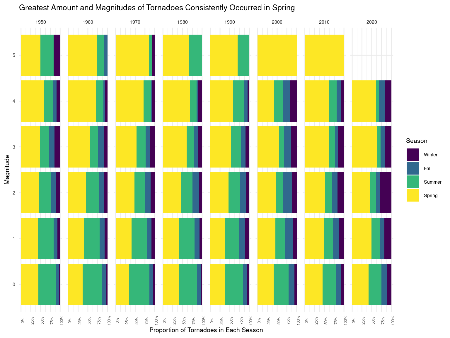
Figure 4
Discussion
Based on Figure 3, we can tell that across the vertical axis (magnitude), as magnitude increases, generally, tornadoes that occur in Spring take a more and more significant portion of the total tornadoes at that given magnitude level, and when the magnitude is 5 (maximum level of magnitude), then tornadoes occurred in Spring takes up the biggest portion of all tornadoes. This is true across the horizontal axis (decade), which tells us that as the magnitude of a tornado increases (stronger tornado), it is more likely to occur in Spring vs. other seasons, and this is generally true across the time. Additionally, if we look horizontally across the horizontal axis (decade), we can tell that the proportion of tornadoes that occur in Spring is generally increasing over time across all different levels of magnitude, which means there might be an increasing seasonal trend over time that more and more tornadoes are happening in Spring vs. other seasons. Overall, from the plot, we can easily tell that the portion of tornadoes that happened in Spring is consistently the biggest across different levels of magnitude as well as over time, which aligns with our personal experience as well as our expectation about the seasonality of tornadoes.
Then, after understanding the seasonality of tornado frequency and magnitude, we decided to take a look further into the actual consequences of tornado, fatalities (fat), and how it varies by season (season) across decades (decade). As discussed in the approach section, we decided to use the average total yearly fatalities (avg_fat) of each decade as a measurement of fatalities. This is because we need to account for the fact that there are only three years of data in the decade of 2020 but 10 years of data for every other decade, and therefore we need to take the yearly average to ensure comparability. Additionally, we are also more interested in the bigger picture in terms of the total damage caused by tornadoes over a period of time, and therefore taking the yearly average makes sense for the purpose of our investigation as well. Specifically, based on Figure 4, we can tell that the tornado-caused fatalities decreased from the 1950s to the 2000s, but are showing a slight rebound from the 2000s to now. The reduction of fatalities from the 1950s to the 2000s can possibly be explained by the improvement in damage control as people and government become more aware of the issue and therefore allocating more resources to prevent and control the damage caused by tornadoes. However, the increase in fatalities after the 2000s might be alarming for policymakers and scientists, as it might be related to recent climate change and global warming in the 21st century. Seasonality-wise, most of the fatalities are still caused by tornadoes happening in Spring, which aligns with what we observed from Figure 3 (stronger and more frequent tornadoes in spring vs. other seasons). Additionally, the proportion of fatalities caused by tornadoes in Summer reduced significantly while the proportion of fatalities caused by tornadoes in Winter increased over time. Besides, we can see that the average magnitude also follows the same trend as the average fatalities (decreased from the 1950s to the 2000s and rebounding from the 2000s to now), which can potentially imply that the stronger the average magnitude of tornadoes in a year is, the more fatalities the tornadoes might cause.
In terms of the lines of average magnitude, they don’t reveal much more additional information on a standalone basis; however, it is interesting that the average magnitude of tornadoes in winter has been consistently greater than that in Spring (which is considered as the season with most and strongest tornadoes based on Figure 3). We believe that this can be explained by the fact that Figure 3 only considered the percentage of tornadoes in each season at each given magnitude level but did not account for the fact that there are way more tornadoes at lower magnitude levels compared to those at high magnitude levels. Therefore, while most of the tornadoes with magnitude 5 happened in Spring, because there’s only a very limited number of tornadoes at level 5 magnitude, it won’t affect the average magnitude as much. Moreover, based on Figure 3, we can discover that magnitude-wise, the magnitude of tornadoes in winter mostly concentrates at higher levels like 2-4, and therefore it might be another explanation of why the average magnitude of tornadoes is higher in winter than in Spring. Overall, looking at the two plots Figure 3 and Figure 4 together, we realize that while average magnitude and average fatalities do allow us to get a lot of insights in terms of tornado seasonality, we do need to also recognize the limitations of our dataset and visualizations. For example, the two plots aren’t able to capture the actual distribution of magnitude and fatalities of tornadoes over time, and this can be important for us to look more into since a lot of time, the handful of tornadoes with high magnitude and super high fatalities can be processed as outliers and therefore overlooked in our analysis.