Teardrops on my GitR: A statistical exploration of musicality in Taylor Swift’s discography
STA/ISS 313 - Project 1
Abstract
Taylor Swift has been producing music for nearly 18 years. In the last year, thanks to the Era’s tour, her popularity has exploded. Between her 10 distinct studio albums and hundreds of songs, her discography has a huge variety of features. Music streaming app Spotify has collected significant data on various traits of Taylor Swift songs, and the goal of this project is to examine what information we can derive from a wealth of Taylor Swift song data. We will investigate the relationships between descriptive features of songs like their energy levels and the popularity of Taylor Swift’s albums as well as the differences between songs considered bonus tracks versus album tracks to provide information on changes to Taylor’s music over time and patterns in the characteristics of her songs.
Introduction
The Taylor R package/dataset was curated by W. Jake Thompson from data collected from the American digital media company Genius and Spotify API.
The R package contains three datasets:
taylor_album_songs - 29 variables with 194 observations
taylor_all_songs - 29 variables with 274 observations
taylor_albums - 5 variables with 14 observations
We chose this dataset because, as avid Taylor Swift listeners, we knew that her extensive song catalog would provide a robust dataset to analyze. We expect that the diversity in the distribution of her songs and the variety between albums will naturally produce an array of both numerical and categorical variables that can be used to build an engaging narrative.
Question 1: Love the energy! … Or do we?
Introduction
“Is there a relationship between an album’s average energy level and its critical reception?”
This question will explore how the features of Taylor Swift’s music contribute to the critical reception of her albums. We will visualize the features of the songs on each album available in the dataset by energy score and plot them against the album’s average metacritic score and average user score. Metacritic scores represent a weighted average of a curated group of reviews on metacritic.com. User scores are an average value of reviews from the larger body of all Taylor Swift listeners. These scores attempt to summarize an album’s critical reception into a single numeric score. The “energy” of various Taylor Swift songs is something that has varied over time. Some songs feel more energetic than others, and listeners have varying preferences when it comes to high or low energy songs. Our question is really: “Do the critics prefer more or less energetic versions of Taylor Swift?” We will look for connections between these musical features of individual songs and their impression on each album to see if there is a consensus in the trends between song energy and the album’s overall critical success.
Approach
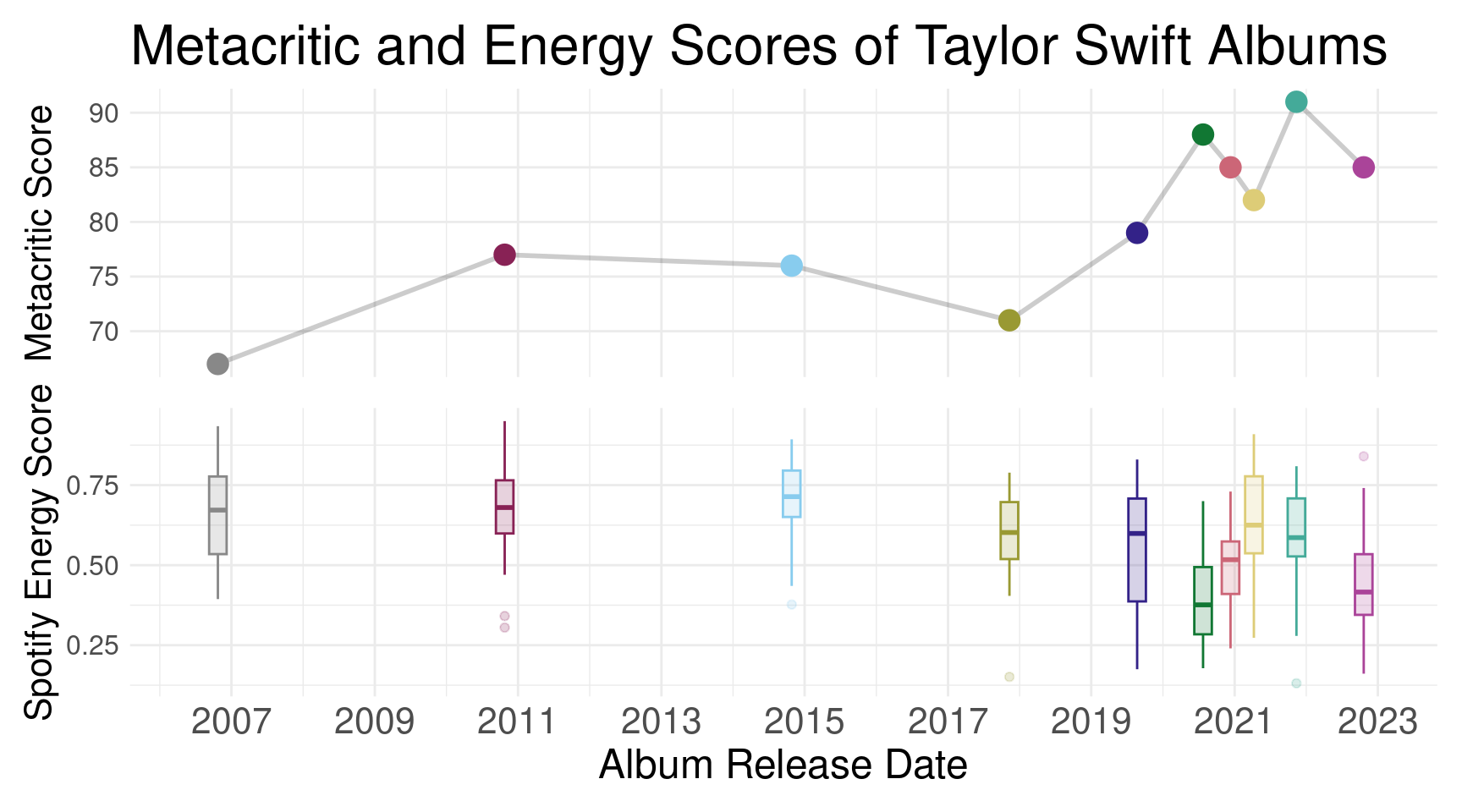
The first visualization we intended to create is one that shows the relationships between album release date, the album’s Metacritic score, and the distribution of one of the Spotify song characteristics. After some exploratory data analysis, we decided to choose “energy” as the characteristic to use in the plot, as it was a characteristic that appeared to have the strongest correlation with Metacritic score. With this in mind, we decided to use patchwork to put together two plots, both of which would map color to each of 10 individual albums using a colorblind-friendly color scheme. First, we created a line plot showing the metacritic scores of each of Taylor’s full albums. This plot effectively shows the changes in Metacritic scores of her albums over time since the lines create a sense of both continuity and change. Next, we created a box plot that shows the distributions of songs’ energy scores across all of Taylor’s full albums. We decided to choose box plots as they are a great way to visualize distributions, showing us the summary statistics for each album (mean, quartiles, and outliers) in a succinct and aesthetically-pleasing manner. Importantly, the box plots pair well with the aforementioned line plot as they share the same x-axis of album release date, as well as the same color scaling based on the albums.
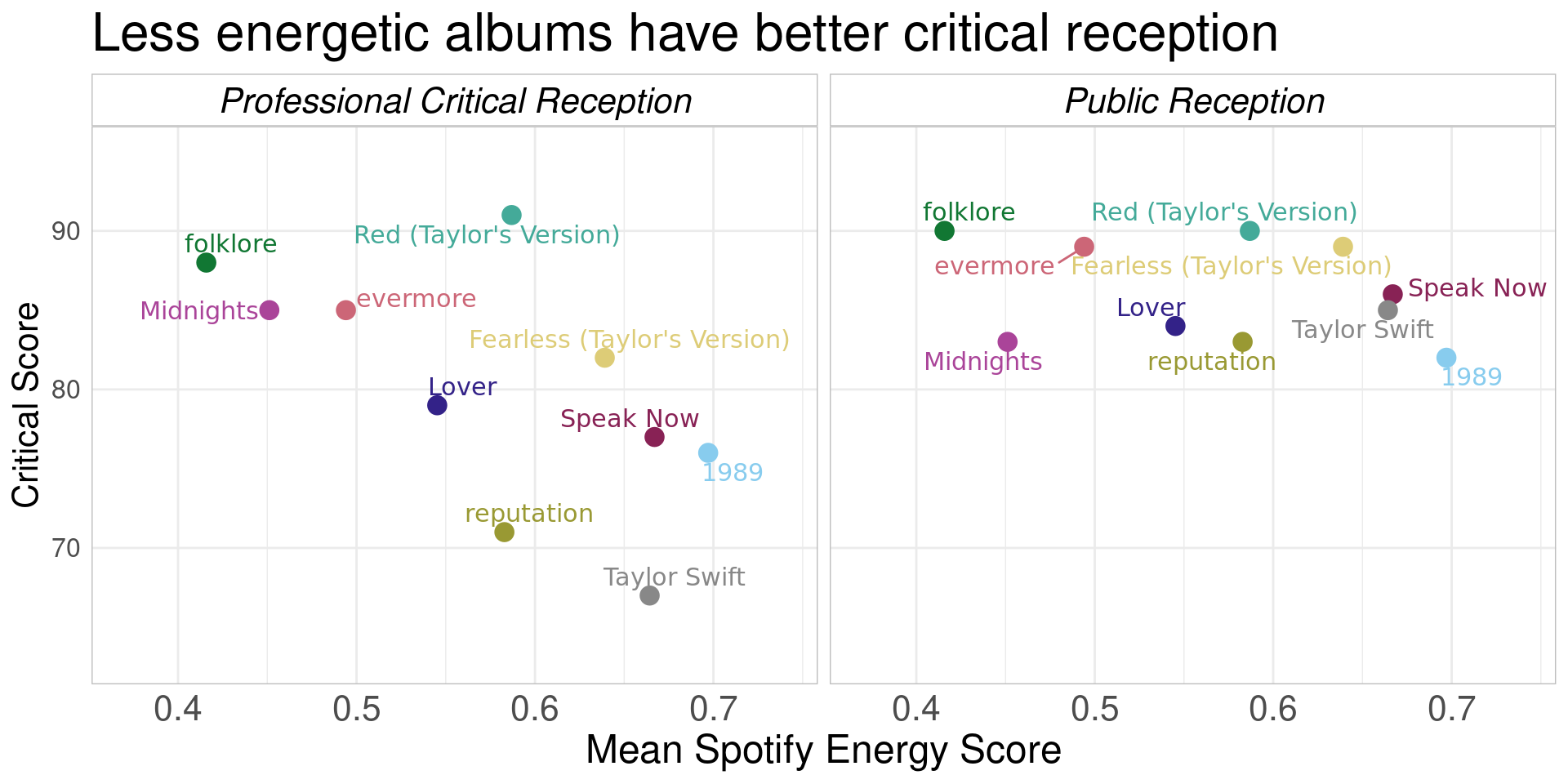
The second visualization we intended to create is one that reveals the difference between professional critical reception (again, the Metacritic scores) and general public reception (defined by the user scores provided in taylor_albums) with regards to the average energy score of each of Taylor’s full abums. We introduced the use of faceting to create side-by-side scatter plots comparing professional reception to public reception, with average energy score on the x-axis and reception score on the y-axis. We colored the points by album again with a matching colorblind-friendly color scheme, keeping a sense of continuity with the first visualization. We believe this visualization is appropriate as the scattering of the points can reveal strikingly different patterns between the two types of reception.
Answering this question required datawrangling that involved merging 2 of the TidyTuesday datasets: taylor_albums and taylor_album_songs. This allowed us to associate features of individual songs that lie in the taylor_album_songs dataset and the critic scores which are in the taylor_albums data set so that we can use the variables energy, album_name, album_release, metacritic_score, and user_score all together. We also created a new dataframe that has the average value of the various Spotify song feature metrics along with the user and Metacritic scores so that we could visualize trends in means.
Analysis
Discussion
In Figure 1, which shows album metacritic scores and song energy scores of Taylor’s albums, we can see a general trend that, on average, the energy of her songs have decreased over time, while metacritic scores have increased over time. Thus, there appears to be a weak negative correlation between an album’s average energy score and its metacritic score. However, it is important to note that correlation does not equal causation. It is easy to see that this relationship is prone to having one or more confounding variables. For example, Taylor Swift has notably increased in popularity over the course of her career. As a result, the public perception of her as an artist may have become more positive as she transitioned from a nobody to a popstar; this could in turn influence critics to tend to give more positive ratings to her albums.
As we examine Figure 2, the second plot that compares the professional critical reception scores of Taylor’s albums to their public reception scores with respect to mean energy score, we can see a striking difference between the two. On the left, we observe that there appears to be a clear downward trend between mean energy score and Metacritic scores. This corroborates the conclusion we made from the previous visualization. However, as we examine the facet on the right, we can see that this trend does not hold for user scores - in fact, there seems to be a distinct lack of any relationship between energy score and user score. In other words, albums that scored poorly with professional critics did not correspondingly score poorly with the general public; even if we postulate that an average energy score of an album has an effect on its Metacritic score, this effect is completely absent from influencing the user scores. A possible explanation for this is that it is likely that the people who are submitting user scores may tend to be fans of Taylor Swift themselves. A Taylor Swift hater may be less likely to take the time out of their day and submit a negative rating, but a Swiftie might feel as if it is their duty to provide support for Taylor in the form of a positive rating. Thus, we must be cautious about recognizing the possibility of user bias in this data.
Question 2: Bonus tracks, bonus dancing?
Introduction
“How do bonus tracks differ from album tracks? Do the two groups show different trends from the other songs on their respective albums?”
In answering this question, we looked for musical differences between songs that were released with Taylor Swift’s original albums and the “bonus tracks” released with her albums. Differences may provide insight into Swift’s reasons for omitting the tracks from the original cut and the evolution of her style. The Taylor Swift datasets track musical features in a variety of variables, and we considered features including tempo, danceability, duration, and loudness. We also used release date to track the evolution of bonus and album tracks over time.
Approach
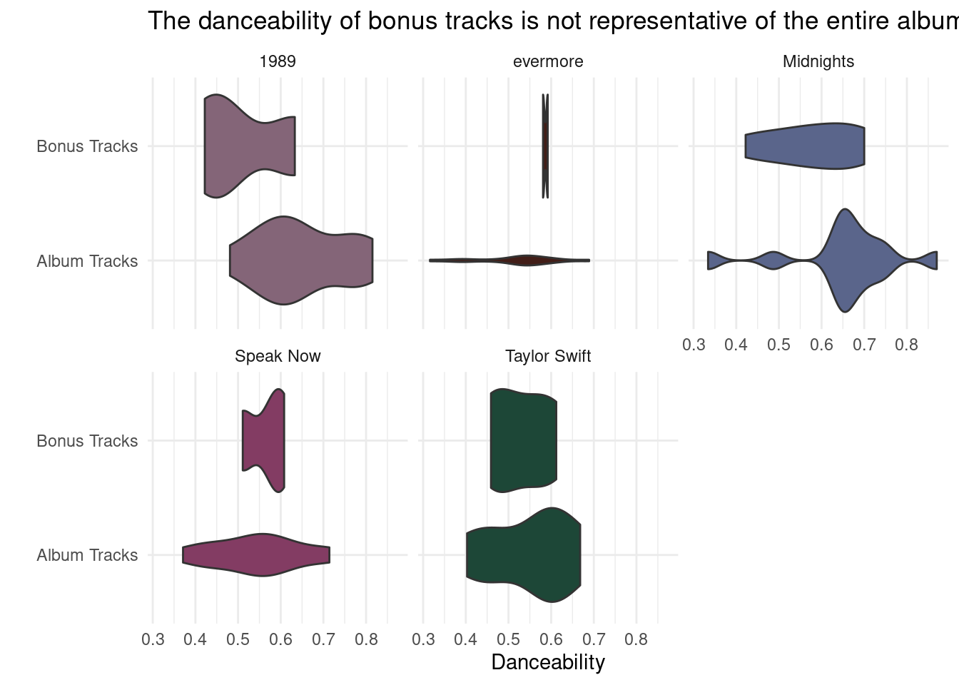
The first visualization for this question visually compares the danceability of bonus and album tracks on the same album. We wrangled the taylor_album_songs dataset by manually filtering for albums containing bonus tracks (1989, evermore, Midnights, Speak Now, and Taylor Swift) and mutated the bonus_track variable to aid labeling. Then we created a violin plot showing the distribution of danceability for album and bonus tracks. To observe trends within individual albums, we faceted the visualization by album_name. The violin plot was useful for observing density - while the mean danceability between albums is similar, their distributions are variable.
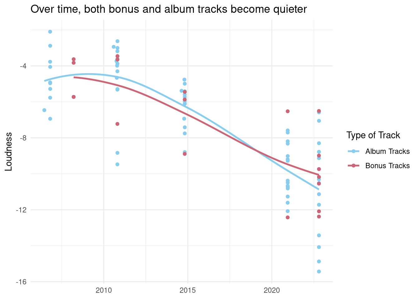
For the second visualization, we analyze how loudness changes over time for the subset of standard album tracks and the subset of bonus tracks. We created a scatter plot to show the distribution of loudness over time and colored the points to show the trends for both album and bonus tracks. A scatterplot is useful here to see the distribution and emphasize that we are looking at metrics for individual songs.
Analysis
Discussion
In Figure 3, we see that for each album that has bonus tracks, the distribution for danceability metrics differ between the subset of album tracks and the bonus tracks. For all five albums, the danceability values span a larger range within the album tracks than the bonus tracks, which indicates that the bonus tracks fit into a a narrow scope. We can interpret from this that Swift has an intentional vision for her bonus tracks that fit together, whereas her vision for the album tracks is often more diverse. However, we can note that the range for the bonus tracks does fall under the larger range for the album tracks, which implies that she still crafts her bonus tracks to fit the larger theme of the album. This understanding leads us into our second visualization.
In Figure 4, we visualize how the loudness metric changes over time with bonus tracks and album tracks. We see that the distribution is similarly spread out over a large range of loudness values for both types of tracks. We can also see from the coloring, that they both follow a similar trend of become quieter (a lower, more negative loudness value) as time progresses. The latest releases have the lowest loudness metrics.
From these two visualizations, we can begin to build an understanding that there may not be a stark difference between her standard album tracks and her bonus tracks. We originally hypothesized that if Swift was to differentiate between standard tracks and bonus tracks, there must be some musical difference between the songs to warrant the classification. However, noting that the distributions, although narrower, for danceability falls within the larger distribution of the album tracks and that they follow the same trend of decreasing loudness over time, we can see that this hypothesis may not be true. We can speculate that Taylor Swift does not include bonus tracks to include songs that she didn’t feel necessarily fit the album but rather to add additional tracks for fans that didn’t make the standard version.