library(tidyverse)
library(gganimate)
library(ggthemes)
library(scales)
library(sf)
library(rnaturalearthdata)
library(rnaturalearth)Energy Consumption and Production in the US vs China
STA/ISS 313 - Project 1
energy <- read_csv("data/owid-energy.csv")
us_china <- energy |>
  filter(country %in% c("United States", "China", "World"))
Abstract
In this project, we investigate data from the Energy Explorer created by Our World in Data to analyze per-capita energy production and consumption of the US and China before and after significant events: 1949 Chinese Communist Revolution and the first UN COP (Conference of the Parties) meeting on climate change in 1995. We analyze the US and China energy productions, specifically in oil, gas, coal, and renewable energy through an animated bar graph, afterwards, honing in on renewable energy to see which country has moved the fastest away from fossil fuels. We determine that the World averages and China are comparable, but are both larger producers of renewable energy production than the United States. Additionally, we analyse US and China consumption of fossil fuels on a global stage, and notice that North American countries are more to blame on oil consumption rather than Asian and Middle Eastern Countries (an irregularity being Saudi Arabia which is leading in Oil Consumption per Capita). Lastly, we compare the US and China oil consumption differences (year over year) prior to 1995 (First COP meeting) and afterwards. We notice that since 1995, China and US oil consumption mirror each other’s rise and falls, and both fluctuate dramatically due to worldwide events such as the 1973 Yom-Kippur War, 1979 Iranian Revolution, financial crises, and the COVID-19 pandemic.
Introduction
Our dataset comes from the Energy Explorer created by Our World In Data. They have aggregated energy production data for nearly every country on Earth from 1900 to 2020. Alongside this energy production data are the population and GDP of each country in each available year, allowing for per-capita energy output analysis. Growth rates for each energy production type are also included. For much (but not all) of our analysis, we subset the data to only include the US, China, and the global totals.
Question 1: The US, China, and Electricity
Introduction
The environmental competition, be it real or imagined, between the US and China has been at the forefront of American political discourse on climate for years. Americans who feel hesitant about climate regulation on large companies often point out that China’s emissions are so massive that cutting ours would only be a drop in the bucket. But is China’s electricity production worse than the United States’ per capita?
Approach
To investigate the per-capita energy production of the US and China, we’ve subset our energy data only to include those two countries and the global total. To avoid the overwhelming experience of deciphering three side-by-side area plots, we’ve compared the proportion of electricity production by type using an animated bar graph. Our data begins in 1985 (when the production numbers started being tracked) and ends in 2021.
Furthermore, we want to focus specifically on renewable energy production in the global superpowers. Again from 1985 to 2021, we’ve display the share of electricity production from renewables for China, the US and the world.
Analysis
animation_data <- us_china |>
  select(year, country, matches("_electricity$")) |>
  pivot_longer(cols = -c(year, country), names_to = "type") |>
  mutate(
    type = str_replace(type, "_electricity$", ""),
    type = str_to_title(type)
  ) |>
  filter(
    type %in% c("Coal", "Oil", "Gas", "Renewables"),
    year >= 1985
  ) |>
  mutate(
    across(everything(), ~ replace_na(.x, 0))
  )

plot <- animation_data |>
  ggplot(aes(y = country, x = value, fill = type,
             label = as.character(year))) +
  geom_col(position = "fill", color = "black") +
  theme_minimal() +
  transition_states(year, wrap = FALSE) +
  geom_text(
    x = 0, y = 3.8,
    hjust = "left", vjust = "center", size = 17,
    color = "lightgray", fontface = "bold"
  ) +
  scale_fill_manual(values = c("Coal" = "#DC3220",
                                "Oil" = "#DDCC77",
                                "Gas" = "#1E88E5",
                                "Renewables" = "#AF4300")
  ) +
  coord_cartesian(ylim = c(1, 3.5)) +
  labs(
    x = element_blank(),
    y = element_blank(),
    fill = element_blank(),
    title = "US, China, and global electricity production",
    subtitle = paste("Proportion of coal, gas, oil, and renewable",
                     "energy production (1985-2021)")
  ) +
  transition_time(round(year, 0)) +
  ease_aes("quadratic-in-out") +
  theme(
    legend.position = "bottom",
    plot.title = element_text(size = 20, face = "bold"),
    plot.subtitle = element_text(size = 15),
    axis.text = element_text(size = 15),
    legend.text = element_text(size = 15)
  )

animate(plot, height = 600, width = 900, units = "px")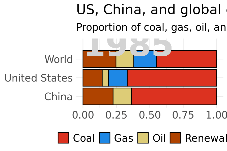
renewables_data <- us_china |>
  select(country, year, renewables_share_elec) |>
  filter(year >= 1985) |>
  mutate(country = fct_relevel(country, c("United States", "World", "China")),
    renewables_share_elec = round(renewables_share_elec / 100, 4))

CHINA <- "#DC3220"
US <- "#1E88E5"
WORLD <- "#DDCC77"

standard_cb_palette <- c("United States" = US, "China" = CHINA, "World" = WORLD)
country_shapes <- c("United States" = 21, "China" = 22, "World" = 23)

renewables_data %>%
  ggplot(aes(x = year, y = renewables_share_elec, color = country)) +
  geom_line(aes(color = country), linewidth = 1) +
  geom_point(aes(shape = country, fill = country),
             size = 3, stroke = .5, color = "white") +
  annotate(geom = "text", label = "China", color = CHINA, x = 2017, y = .28,
    fontface = "bold", size = 5) +
  annotate(geom = "text", label = "US", color = US, x = 2018.5, y = .205,
    fontface = "bold", size = 5) +
  annotate(geom = "text", label = "World", color = WORLD, x = 2019, y = .242,
    fontface = "bold", size = 5) +
  scale_color_manual(values = standard_cb_palette) +
  scale_shape_manual(values = country_shapes) +
  scale_fill_manual(values = standard_cb_palette) +
  theme_minimal() +
  labs(title = "US v China Renewable Electricity Production",
       y = "% Renewable Energy Share", color = "Country",
       shape = "Country", fill = "Country",
    caption = "Source: Our World in Data (TidyTuesday)") +
  scale_y_continuous(labels = percent_format()) +
  scale_x_continuous(breaks = seq(min(renewables_data$year),
                                  max(renewables_data$year), 5),
                     minor_breaks = seq(min(renewables_data$year),
                                        max(renewables_data$year), 2.5),
                     labels = function(x) ifelse(x %% 10 == 0, x, "")) +
  guides(color = guide_legend("Country",
                              override.aes = list(shape = c(22, 21, 23)))) +
  theme(legend.title = element_text(face = "bold"),
        axis.title.x = element_blank(),
        legend.position = "none")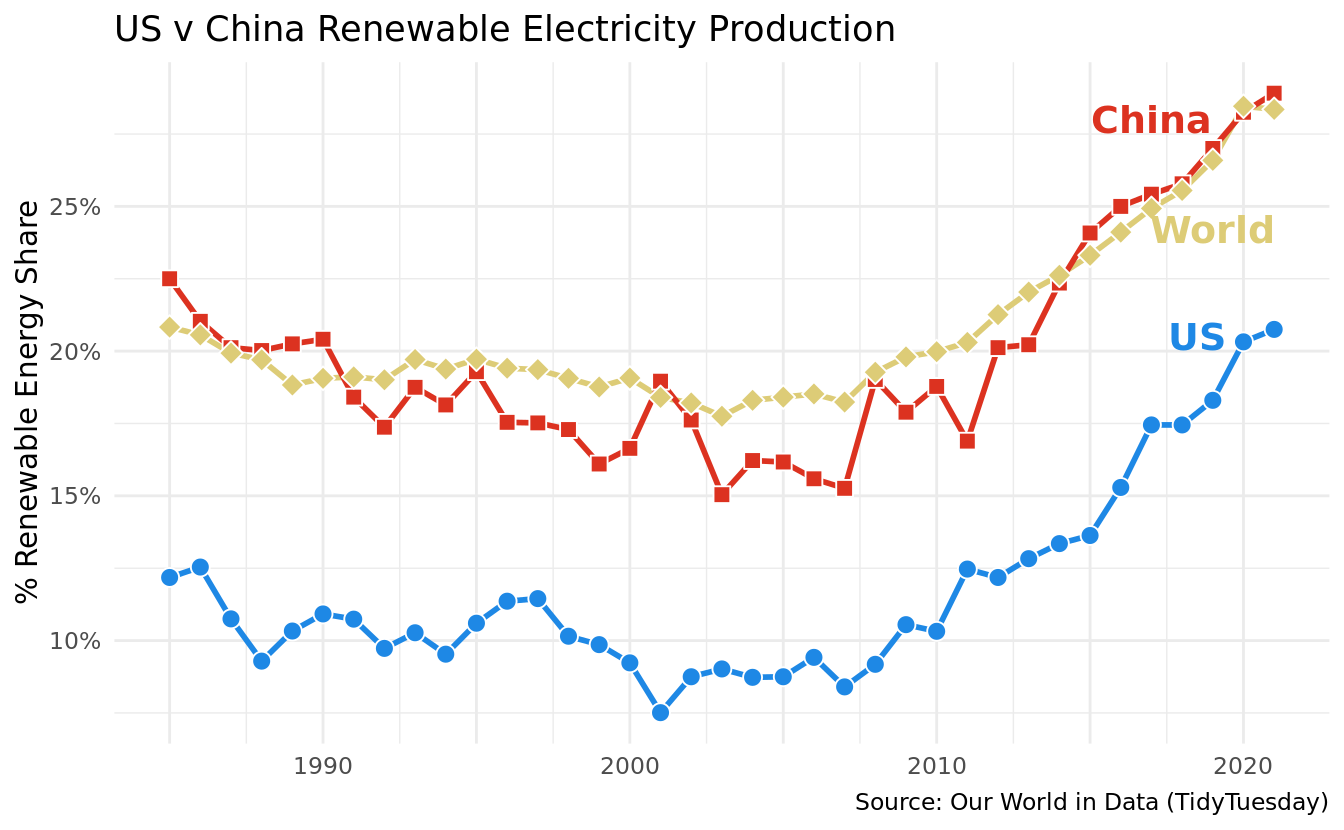
Discussion
In these two figures, parsing out the relative successes and struggles of the US and China in terms of renewable energy is complex. While the comparative proportion of coal is much higher in China, especially in recent years, China’s reached and surpassed the average global share of renewable electricity production and the US lags behind. While it is important to remember that absolute numbers matter in this case (i.e., emissions per capita translate to higher total emissions in China, where the population is much higher), the argument that the US is already outperforming China on renewables does not hold water.
Observable in the animated graph is the rapid rise in recent years of natural gas for energy production across the world. In the US, where hydraulic fracturing has grown and now produces most gas in the country, natural gas has overtaken coal in share of electricity produced. China still uses far more coal. Natural gas results in fewer emissions than coal or petroleum, but it’s still a fossil fuel nonetheless.
When looking at the proportion of electricity produced from renewables since 1985, the US dramatically lags behind both China and the world. However, among all three we observe a rise in share of renewable energy production since the early 2000s, highlighting global acceptance of climate change and a growing commitment among nations to invest in renewable energies.
Question 2: Energy Consumption in the US and China
Introduction
Our second question is how has energy consumption changed since 1995 (when the first UN COP meeting on climate occurred) in the US, China, and globally? Which has made more progress away from harmful energy production since climate change became a global talking point?
We are interested in this question because it allows us to draw comparisons on first to what extent the US and China are consuming fossil fuels and additionally, how fast they are moving away non-renewables after learning about their dangers in the UN COP meeting. The UN COP meeting was the first time countries discussed the dangers of climate change at a global stage, and essentially, we can analyze the effectiveness that this meeting and others following it had to create global change in energy consumption.
Approach
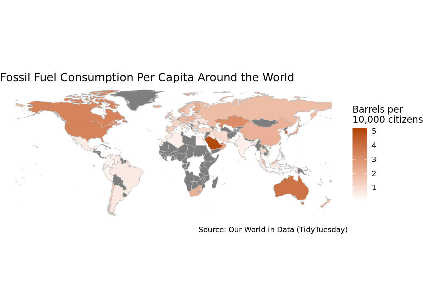
Using the world_oil dataframe, our first graph would look at world oil consumption as a share of total world energy (utilizing oil_share_energy) for the last four decades (1981-2021) to investigate whether the world has shifted from oil. Prior to these decades, renewable energy was not widely available and was therefore not widely reported, so we will only subset the relevant decades for this analysis. We will use a world map geom to fill in countries with the most oil consumption as a gradient to those with the least oil consumption. We wanted to implement a geom_map so that we could see the breakdown of oil consumption by countries to ensure that the US and China were major players in the space (as they are seen to be below).
Additionally, we’ll compare the trends in oil by breaking the data into “before 1995” and “after 1995.” We will analyze the changes before and after the Chinese Communist Revolution. That way, if there is a decline post-1995 but also pre-1995, we could hypothesize that the UN pressures weren’t as impactful as a pure analysis of post-1995 would lead us to believe. The x-axis would be years, the y-axis oil consumption, and a line graph with the US before 1995, US after 1995, China before 1995, and China after 1995. Before 1995 would be a different line type than after and the US and China would have different colors. Comparing the trends utilizing a bar graph over time allows us to notice sizable differences in the changes of energy consumption year over year. This allows us to better infer the impact of the UN COP meeting and meetings subsequently afterwards.
Analysis
energy2 <- energy |>
  filter(country %in% c("United States", "China")) |>
  filter(year >= 1970)

annot_text <- str_wrap(paste0(
  "In 1995, the first UN COP event happened, discussing the newly-accepted ",
  "threat of global climate change."
), width = 30)

ggplot(data = energy2) +
  geom_col(data = filter(energy2, country == "United States"),
    aes(x = year, y = oil_cons_change_twh, fill = country), color = US,
    alpha = 0.5) +
  geom_col(data = filter(energy2, country == "China"),
    aes(x = year, y = oil_cons_change_twh, fill = country), color = CHINA,
    alpha = 0.5) +
  scale_size_manual(values = c("Before 1995" = 2, "After 1995" = 1)) +
  scale_color_manual(values = c("China" = "#DC3220",
                                "United States" = "#DDCC77")
  ) +
  scale_fill_manual(values = c("China" = CHINA, "United States" = US)) +
  theme_minimal() +
  labs(
    title = "US/China oil consumptions differences (year over year)",
    x = element_blank(),
    y = "Change in oil consumption, in terawatt-hours\n(from previous year)",
    fill = element_blank(),
    caption = "Source: Our World in Data (TidyTuesday)"
  ) +
  geom_vline(xintercept = 1995, linetype = "dashed", color = "black") +
  annotate(geom = "text", x = 1994, y = 1100, vjust = "top",
    label = annot_text, size = 4, hjust = "right", color = "black") +
  theme(panel.grid.major.x = element_blank(),
    panel.grid.minor.x = element_blank(),
    legend.position = "top")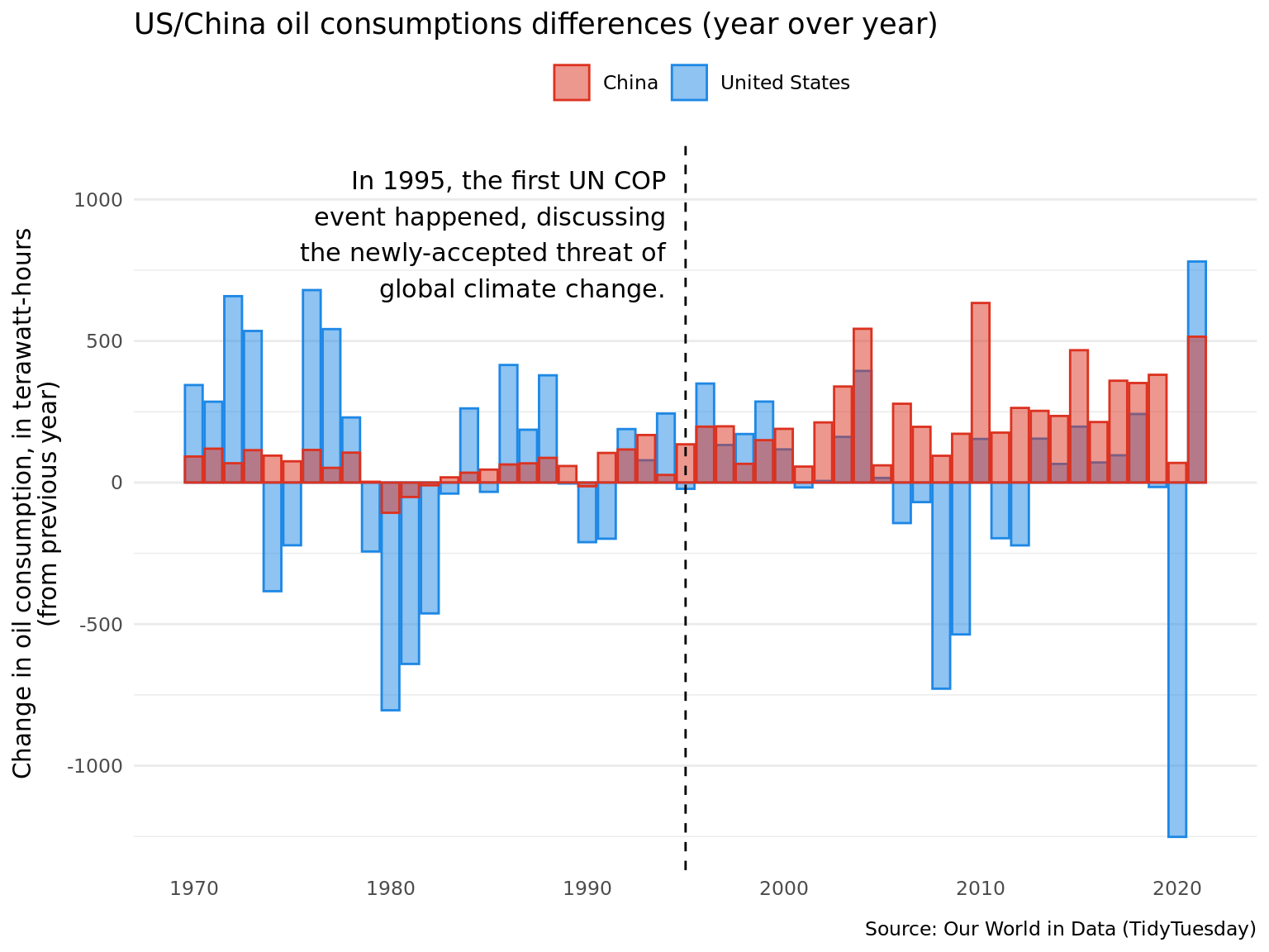
Discussion
Since we analyze a world map of Oil Consumption per capita, we don’t notice China as one of the largest consumers of Oil as it has been shown in the media and politics. We wanted to make sure that this graph accurately represented the population’s usage of oil in each country in order to compare Apples to Apples. From this, we can infer that perhaps, North American countries are more to blame on oil consumption rather than Asian and Middle Eastern Countries (minus Saudi Arabia which is leading in Oil Consumption per Capita).
Prior to 1990, China oil consumption held quite steady, often with minimal growth year over year. However, since 1995 and the first UN Climate Change Conference, China oil consumption has grown year over year and oscillated more. Rather than ascribe blame to the UN, year over year growth in China oil consumption likely stems from the rapid ascension of their economy since the early 90s.
Unlike China, US oil consumption has fluctuated dramatically both prior to 1995 and since. Dips in US oil consumption correspond with worldwide events. Prior to 1995, these often occurred in oil exporting regions– the 1973 Yom-Kippur War and 1979 Iranian Revolution. Since 1995, US oil consumption drops occur simultaneously with major financial crises – 2008 and COVID-19 in 2020.
Especially since 1995, China and US oil consumption mirror each other’s rise and falls, although China’s changes are less dramatic. The graph does not give any conclusive evidence that oil consumption among the current two global superpowers has declined since the first UN Climate Change Conference.
We have a few limitations in our project. Firstly, we had to remove Singapore from the world_map data since it’s fossil fuels consumption was much higher than all of the other countries and was skewing the scale. Thus, we know that Singapore is an Asian country with the most fossil fuel consumption per capita, but since we are focusing on the US and China this information should not impact our analysis. Secondly, when we consider fossil fuels we add barrels of oil, tons of coal, and gas volumes together. In terms of a “unit” of a fossil fuel, this does not make much sense so you cannot use the units on our world map as a guaranteed number of “fossil fuel” instead it is simply used as a scale to see countries that are lower or greater on their fossil fuel usage. Third, we had to subset our data from 1985 onwards to ensure that there was enough data per country in our energy production and consumption categories. Thus, when we are looking at before and after the first UN COP in 1995, we can only trace back 10 years prior to the meeting instead of the 28 years we are looking at post-COP.